Box 2 because the important text is more prominent.
4 Likes
![]() I think I’ll wait until the movie comes out.
I think I’ll wait until the movie comes out. ![]()
3 Likes
I’m thinking I like option 2 myself
2 Likes
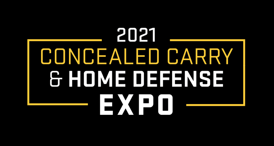
That’s a big improvement. One of the reasons I chose 1 was due to the misaligned “2021” and “Expo”.
If we’re allowed to suggest edits the ampersand should be somewhat greyed and centered in the box between the first and second lines as well. Having it on the left creates an imbalance in the frame.
Where’s the USCCA branding?!
That’s my $0.02
3 Likes
On the Box POPs right out.
1 Like